Unsolicited Commercial Email (SPAM)
Monthly SPAM Volume
This graph shows the accumulation of SPAM email in a single PBRC email
account tabulated on a monthly basis. The orange line shows the
number of SPAM email messages. The blue line shows the size of SPAM
email folder. If the average SPAM message is always the same size,
these two lines should track each other. Trends in SPAM message size
over time are indicated by divergence and convergence of the two
lines. The blue line diverges significantly higher during period between June 2006 and December 2007 due to the use of image files to disguise SPAM.
The sharp decline in SPAM starting with May, 2008 reflects a change in the PBRC mail servers. After that time, the PBRC system began to reject email addressed to several outdated email adddresses (e.g. user@ahi.pbrc.hawaii.edu). This shows that much of the SPAM received before that time was originating from very old email lists being used by the senders of SPAM.

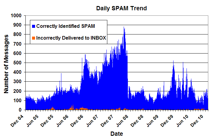
Daily SPAM Trend
Shown below are daily SPAM totals for a single PBRC email account.
Each day is represented by the number of SPAM messages that were
correctly filtered by SpamAssassin (blue) and the number that were
incorrectly delivered to the user's INBOX (orange). The bars are stacked
so the height of the bar represents the total SPAM delivered on that
day.
Updated 1/7/2011.